Client
Horizon Energy+
Project type
RGD Project Based Mentorship
Year
2025
Credits
Janna Montalbo, Ivan Chan, Stephen Zander, David O'Connell
Most energy drinks rely on aggressive, artificial-looking visuals that alienate health-focused consumers. The challenge was to create a design that conveyed energy and vitality without the typical “extreme” aesthetics—balancing natural credibility with shelf appeal while ensuring the product stood out in a crowded category.
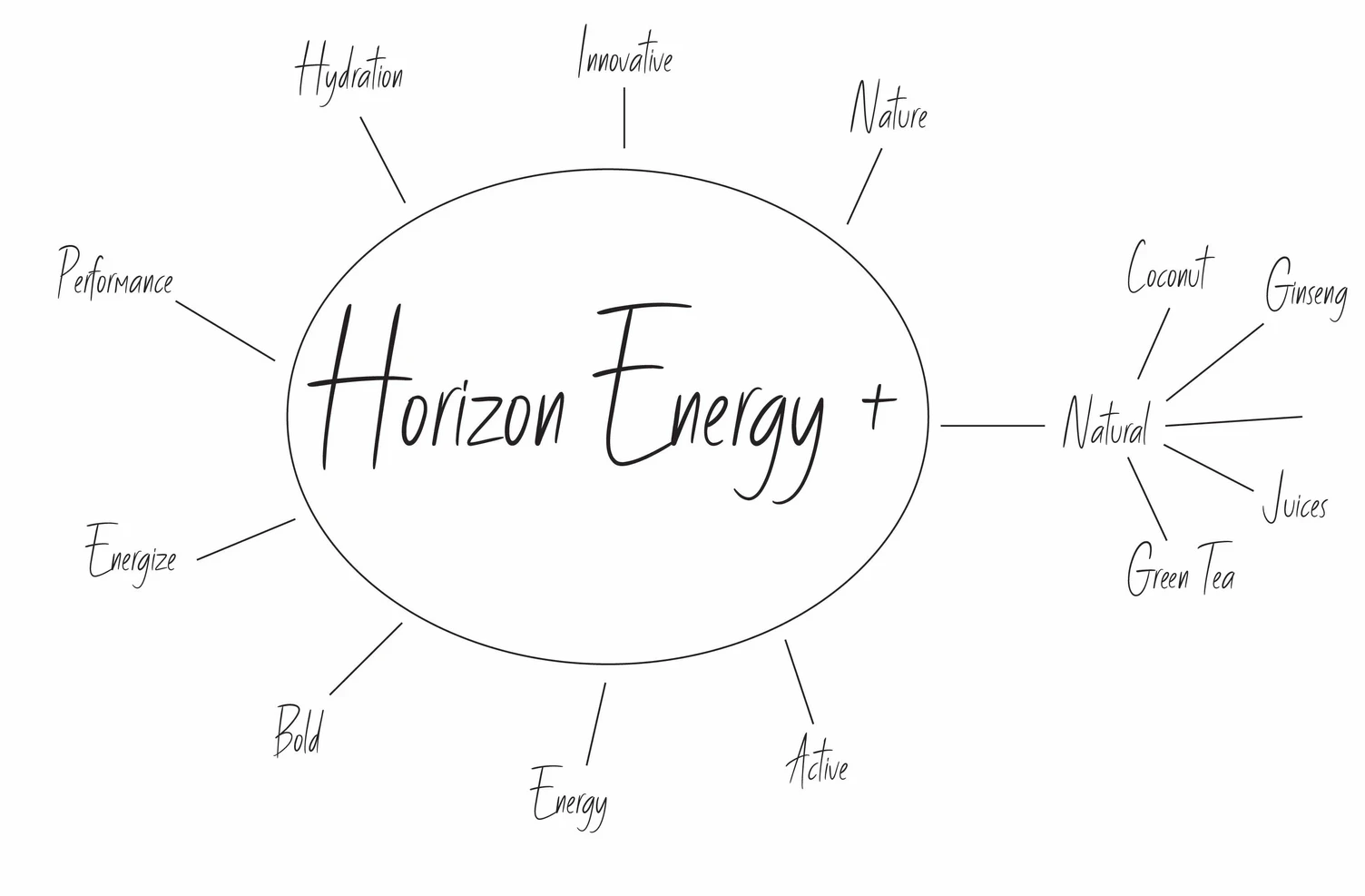
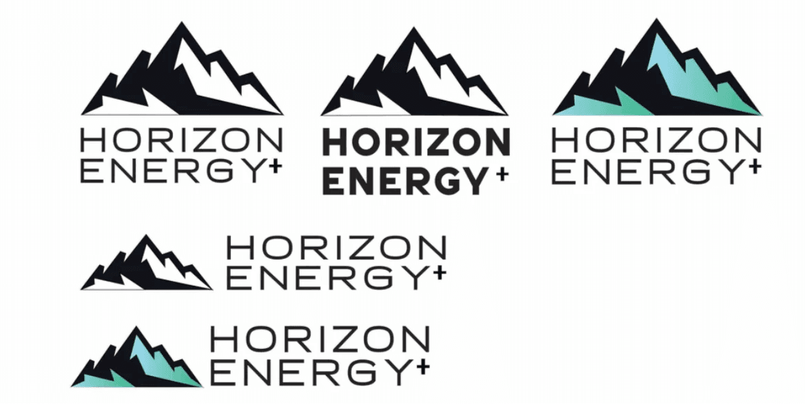
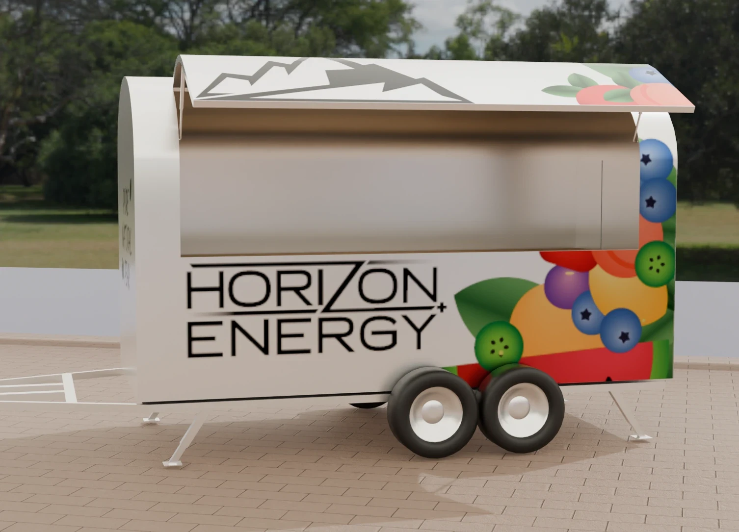
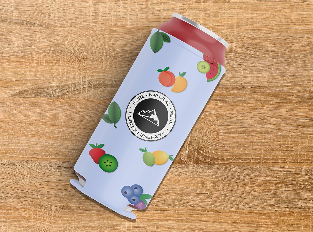
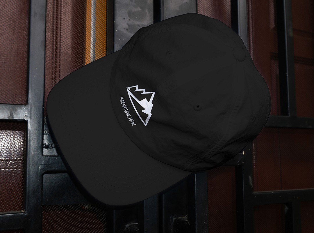
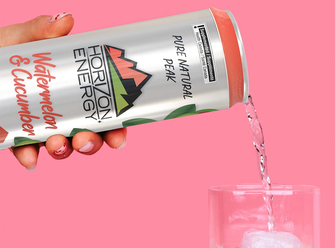
The brand identity emphasized “HORIZON” over “ENERGY,” paired with a mountain peak logo to symbolize nature and peak performance. A subtle angular cut in the “z” suggested lightning and energy, while retaining a clean, minimalist feel. Each of the five flavours was distinguished by a unique gradient logo, fruit-inspired palette, and custom icon set. Vibrant fruit illustrations contrasted with the silver can base, creating a premium, refreshing aesthetic. Clear callout badges highlighted key benefits (0g sugar, natural caffeine, gluten-free, vegan), and multipack boxes featured embossed, flavour-specific logos.
Horizon Energy+ is a clean, natural energy drink designed for health-conscious, active individuals. Using ingredients like green tea extract, coconut water, ginseng, and real fruit juices, the brand differentiates itself from typical energy drinks filled with artificial additives. This project built a modern identity and packaging system to communicate purity, performance, and premium quality. The result was a cohesive, premium packaging system that reinforced the brand’s core message: Pure. Natural. Peak.