Services
Packaging
Visual Identity
Art Direction
Brand Strategy
Client
Hush
Project type
Conceptual Brand
Year
2025
The Ready-to-Drink cocktail market is highly saturated between inexpensive, casual brands and cold, unapproachable luxury options. In-person and digital research revealed a noticeable absence of mystery and intimacy within the category. The challenge was to create a premium ready-to-drink cocktail brand that whispers rather than shouts, appealing to modern social drinkers who value a luxury experience as much as the drink itself.
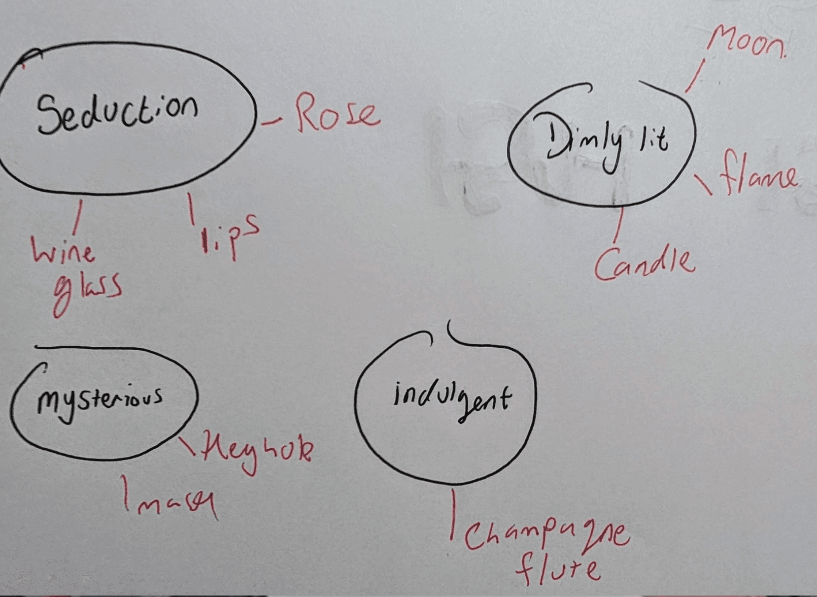
Hush was positioned to bridge the gap between casual accessibility and refined luxury. The strategy centred on intimacy as a visual and emotional language, using a subtle and minimal design to create atmosphere rather than decoration. Inspired by bar culture and dimly lit environments, the brand was designed to feel inviting and personal while maintaining a sense of mystery.
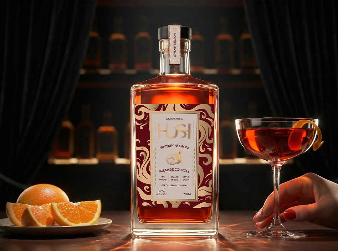
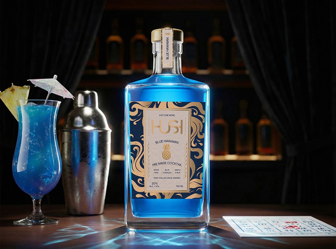
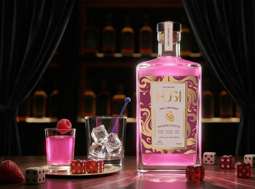
The visual identity for Hush is rooted in subtle expression. The logo takes inspiration from the sound wave of a whisper, reinforcing the brand's core concept of intimacy without becoming overt or illustrative. Typography and layout are intentionally restrained, allowing space and material to carry the emotional weight of the brand rather than relying on graphic complexity. The packaging system focuses on sensory interaction. A soft-touch matte label stock was selected to absorb ambient light, creating a dark, grounded surface. Hot-stamped gold foil detailing contrasts this matte base, reflecting light as the bottle is moved. This interaction produces a visual effect similar to a flickering candle flame in a dimly lit bar, transforming the bottle from a static object into an experience. The vessel itself is a heavy-bottomed square glass bottle with a matte t-cork top, reinforcing the premium position in the market through the weight and clarity of the bottle.Flavour differentiation is distinguished using flowing metallic patterns and subtle colour accents rather than bold colour blocking. This approach maintains cohesion across the flavour range while still allowing each flavour to feel distinct.